
Have you ever wanted to produce HTML based report in NPrinting with some nice, “responsive” charts? I did, and I was very much fired up on how I could use it. Depending on chart library you choose to play with (D3.js, TOAST UI, Chart.js or many others…) your exercise may be slightly different than mine. I am going to use google charts in this example and obviously NPrinting. Important: You have to consider which library you want to work with. Some of them require license key and some are open source.
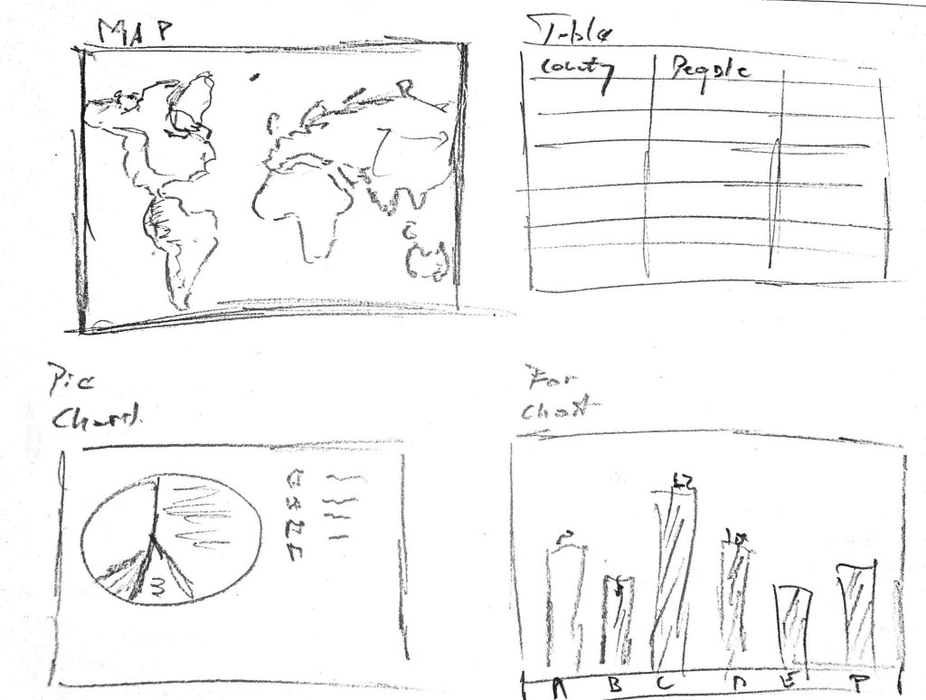
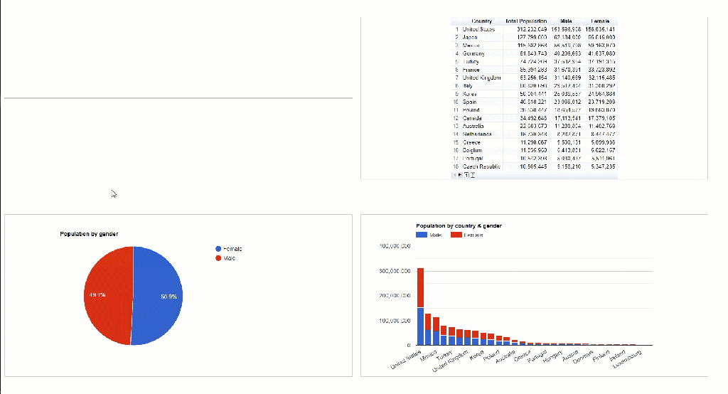
Task: Create 1 page report with map, pie chart, small table and some bar chart. It needs to look like the example below:
Before I start my NPrinting development I need to think of what charts I will use in my HTML report and what data format I will need. First thing you have to do is read documentation of the library you want to use, In my case those are the scripts I will be interested in:
Map using GeoChart: (code source link)
<html>
  <head>
    <script type="text/javascript" src="https://www.gstatic.com/charts/loader.js"></script>
    <script type="text/javascript">
      google.charts.load('current', {
        'packages':['geochart'],
        // Note: you will need to get a mapsApiKey for your project.
        // See: https://developers.google.com/chart/interactive/docs/basic_load_libs#load-settings
        'mapsApiKey': 'AIzaSyD-9tSrke72PouQMnMX-a7eZSW0jkFMBWY'
      });
      google.charts.setOnLoadCallback(drawRegionsMap);

      function drawRegionsMap() {
        var data = google.visualization.arrayToDataTable([
          ['Country', 'Popularity'],
          ['Germany', 200],
          ['United States', 300],
          ['Brazil', 400],
          ['Canada', 500],
          ['France', 600],
          ['RU', 700]
        ]);

        var options = {};

        var chart = new google.visualization.GeoChart(document.getElementById('regions_div'));

        chart.draw(data, options);
      }
    </script>
  </head>
  <body>
    <div id="regions_div" style="width: 900px; height: 500px;"></div>
  </body>
</html>
Looking at the code above you can see that data we will need to be populated dynamically is in [‘Country’, ‘Popularity’] arrays. We will stick to basic map settings for simplicity purposes.
Table using table chart: (code source link)
<html>
  <head>
    <script type="text/javascript" src="https://www.gstatic.com/charts/loader.js"></script>
    <script type="text/javascript">
      google.charts.load('current', {'packages':['table']});
      google.charts.setOnLoadCallback(drawTable);

      function drawTable() {
        var data = new google.visualization.DataTable();
        data.addColumn('string', 'Name');
        data.addColumn('number', 'Salary');
        data.addColumn('boolean', 'Full Time Employee');
        data.addRows([
          ['Mike',  {v: 10000, f: '$10,000'}, true],
          ['Jim',   {v:8000,   f: '$8,000'},  false],
          ['Alice', {v: 12500, f: '$12,500'}, true],
          ['Bob',   {v: 7000,  f: '$7,000'},  true]
        ]);

        var table = new google.visualization.Table(document.getElementById('table_div'));

        table.draw(data, {showRowNumber: true, width: '100%', height: '100%'});
      }
    </script>
  </head>
  <body>
    <div id="table_div"></div>
  </body>
</html>
The same applies to table example where we will be mainly focused on “out of the box” settings and dynamic part will be only an array with data like: [‘Mike’, {v: 10000, f: ‘$10,000’}, true] and column names declared as parameters like: data.addColumn(‘string’, ‘Name’);
My Pie and Bar chart will come from the same library (link to documentation) and the principles are the same. Library expects to receive array with values and can have some properties parameterised.
Let’s start building data source. To start with I created Qlik Sense application with objects having required granularity and data layout. I also created another sheet which has objects for NPrinting with expressions which will create whole array of data required for my chart library. See screenshots:
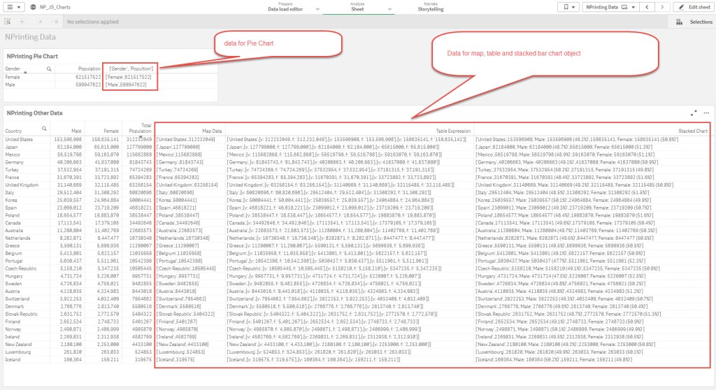
For Map, Table and Stacked Bar Chart I used single Qlik Sense table with Country dimension and measures: Sum(Population), Sum({<Gender={Male}>}Population) and Sum({<Gender={Female}>}Population) measures. Now here are the arrays for HTML charts:
Map:
'['&CHR(39)&Only(Country)&CHR(39)&','&sum(Population)&']'
Table:
='['&CHR(39)&Country&CHR(39)&',{v: '&sum(Population)&', f: '&CHR(39)&num(sum(Population),'#,##0')&CHR(39)&'},{v: '&sum({<Gender={Male}>}Population)&', f: '&CHR(39)&num(sum({<Gender={Male}>}Population),'#,##0')&CHR(39)&'},{v: '&sum({<Gender={Female}>}Population)&', f: '&CHR(39)&num(sum({<Gender={Female}>}Population),'#,##0')&CHR(39)&'}]'
Bar Chart:
='['&CHR(39)&Country&CHR(39)&','&sum({}Population)&','&CHR(39)&'Male: ' &num(sum({}Population))&' ('&num(sum({}Population)/sum(Population),'#,##0.0%')&')'&CHR(39)&',' &sum({}Population)&','&CHR(39)&'Female: '&num(sum({}Population))&' ('&num(sum({}Population)/sum(Population),'#,##0.0%')&')'&CHR(39)&']'Pie Chart – requires different granularity (Gender dimension only) hence separate object supporting it:
'['&CHR(39)&Only(Gender)&CHR(39)&','&sum(Population)&']'
All abovementioned expressions are created as master measures to simplify NPrinting works later. With that in place I can now go to NPrinting, create connection to Qlik Sense app, reload metadata, create new HTML report and edit template. In the NPrinting there is not much we have to do. First we have to bring in our 2 tables as levels and also as tables. In the next step we have to copy/paste scripts from chart library and paste them in right spots in HTML. Below is the whole script I used. I am also putting it as an image to explain each section individually.
<html>
    <head>
        <style>
            html, body {
                height: 100%;
                margin: 0;
            }
            .grid2x2 {
                min-height: 100%;
                display: flex;
                flex-wrap: wrap;
                flex-direction: row;
            }
            .grid2x2 > div {
                display: flex;
                flex-basis: calc(50% - 40px);
                justify-content: center;
                flex-direction: column;
            }
            .grid2x2 > div > div {
                display: flex;
                justify-content: center;
                flex-direction: row;
            }

            .box { margin: 10px; }
            .box1 { background-color: white; }
            .box2 { background-color: white; }
            .box3 { background-color: white; }
            .box4 { background-color: white; }
        </style>

        <script type="text/javascript" src="https://www.gstatic.com/charts/loader.js"></script>
        <script type="text/javascript">
        google.charts.load('current', {'packages':['table']});
        google.charts.load('current', {'packages':['geochart'],'mapsApiKey': 'AIzaSyD-9tSrke72PouQMnMX-a7eZSW0jkFMBWY'});
        google.charts.load('current', {'packages':['corechart']});

        google.charts.setOnLoadCallback(drawStackedChart);
        google.charts.setOnLoadCallback(drawPieChart);
        google.charts.setOnLoadCallback(drawRegionsMap);
        google.charts.setOnLoadCallback(drawTable);

        function drawRegionsMap()
            {
                var data = google.visualization.arrayToDataTable([
                    ['Country', 'Popultion']
                    %%273b292c-dda7-477c-9bc9-669706e2b1fb_Level%%   ,%%YRMNe_1%%
                    %%/273b292c-dda7-477c-9bc9-669706e2b1fb_Level%%
                ]);

                var options = {
                    title: 'Population by Country',
                    colorAxis: {colors: ['#3D5AA7','#88C2EC','#EAF2FB','#F39C67','#B2213F']},
                    backgroundColor: '#FFFFFF',
                    datalessRegionColor: '#E8EAED',
                    defaultColor: '#f5f5f5',
                    keepAspectRatio: 'false',
                    weight: '100%',
                    height: '400'
                };
                var chart = new google.visualization.GeoChart(document.getElementById('regions_div'));
                chart.draw(data, options);
            }

        function drawTable()
            {
                var data = new google.visualization.DataTable();
                    data.addColumn('string', 'Country');
                    data.addColumn('number', 'Total Population');
                    data.addColumn('number', 'Male');
                    data.addColumn('number', 'Female');
                    data.addRows([
                    %%273b292c-dda7-477c-9bc9-669706e2b1fb_Level%%   %%FvRkbM_1%%,
                    %%/273b292c-dda7-477c-9bc9-669706e2b1fb_Level%%
                ]);
                var options = {
                    page: 'enable',
                    pageSize: 18,
                    weight: '550',
                    showRowNumber: true
                    }
                var table = new google.visualization.Table(document.getElementById('table_div'));
                table.draw(data, options);
            }

        function drawPieChart()
            {
                var data = google.visualization.arrayToDataTable([
                    ['Gender', 'Popultion']
                    %%e064296a-2c40-4edd-ace7-859da3589b80_Level%%,%%Gbqphrd_1%%
                    %%/e064296a-2c40-4edd-ace7-859da3589b80_Level%%
                ]);
                var options = {
                    title: 'Population by gender',
                    height: '400'
                };
                var chart = new google.visualization.PieChart(document.getElementById('piechart'));
                chart.draw(data, options);
            }

        function drawStackedChart()
            {
                var data = google.visualization.arrayToDataTable([
                ['Country', 'Male',{ role: 'tooltip' }, 'Female',{ role: 'tooltip' } ]
                %%273b292c-dda7-477c-9bc9-669706e2b1fb_Level%%   ,%%tuxXKmw_1%%
                %%/273b292c-dda7-477c-9bc9-669706e2b1fb_Level%%
                ]);
                var options = {
                    title: 'Population by country & gender',
                    legend: { position: 'top', maxLines: 3 },
                    bar: { groupWidth: '75%' },
                    isStacked: true,
                    height: '400'
                };
                var chart = new google.visualization.ColumnChart(document.getElementById('columnchart_values'));
                chart.draw(data, options);
            }

    </script>
    </head>
    <body>
        <div class="grid2x2">
            <div class="box box1"><div id="regions_div" style="border: 1px solid #ccc"></div></div>
            <div class="box box2"><div id="table_div" style="border: 1px solid #ccc"></div></div>
            <div class="box box3"><div id="piechart" style="border: 1px solid #ccc"></div></div>
            <div class="box box4"><div id="columnchart_values" style="border: 1px solid #ccc"></div></div>
        </div>
    </body>
</html>
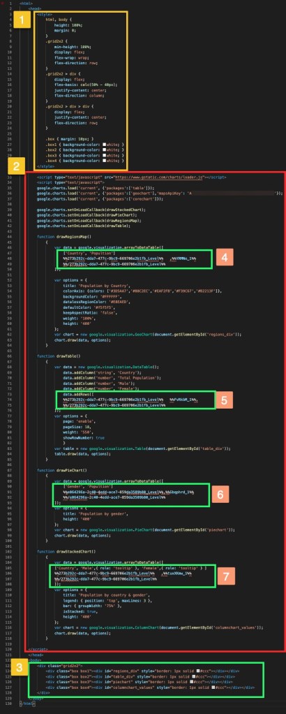
- This section is having some styles I used in my HTML.
- Section 2 contains js scripts from libraries. Dynamic components 4-7 are described below
- Body part of HTML refering to each chart component
- Dynamic section coming from Level and Table (pie chart section)
- 5-7 Dynamic sections refering to Level and Table Columns
For All NPrinting objects we must disable “Keep source format” and in addition for Table objects we must disable “HTML Encode”. I also use “Show Header”=”Hide” as I don’t need headers.

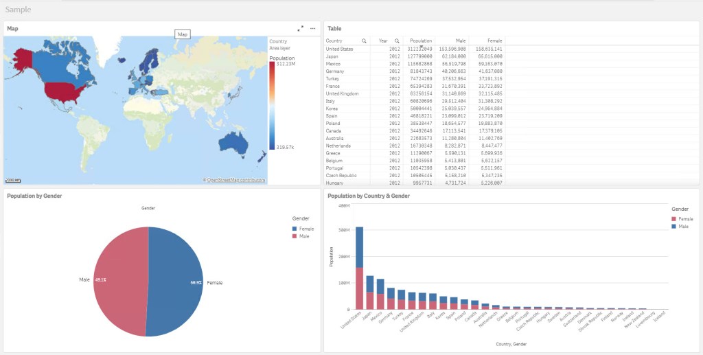
As you can see there is not much required in actual NPrinting template. All hard work is done in Qlik Sense and NPrinting is just creating a ground for JS to do its magic. Here is how the final report looks like:
Summary:
- Was it fun to build it? YES!
- Is it something you would use in production? Maybe?
- Can you send this report in email body? No-you cannot, as JS is not supported in mail clients
- Can you use it offline? I don’t think so, you need access to whatever JS library your script is pointing to.
- I am not web developer and my HTML/JS skills are limited so I probably made tons of mistakes in this.
- QS App sample here: link


Nice work, thanks for sharing. This is the correct way. I believe that HTML reports will be more and more popular.
LikeLike