
Pivot Table topics in NPrinting are frequently coming back on community wall. There is a lot of confusion on how to use them, what is/isn’t supported, how they work, how they can be used in NPrinitng templates and eventually what workaround are in place to create pivot tables in various templates.
Some time ago I came across this topic on community and I thought I will take up a challenge to find a solution on how to build pivot table in html template and embed it in email body. What seems to be an easy task in world of HTML is not as simple anymore when used within email client. Email client don’t support <script> tags for obvious security reasons. Most of the existing solutions to build pivot tables in html are based on some scripts (regardless of what they actually do). My assumption was very simple: I cannot use <script> tags and pivot table needs to be rendered in email client (or at least in most of the popular email clients). In order to achieve this I decided to build my solution on html <table> tag and inline css formatting.
Challenges:
- cannot use <script> tag
- needs to work in mail client
- dynamic column labels
- dynamic number of columns
- merge table cells to provide pivot table like look-n-feel
- cell format and value formatting (background colours, number formats)
- total row/column
The easiest approach to extract data from QlikView/Qlik Sense pivot table to HTML NPrinting template would be by dragging whole entity tag to the template. This brings correct data in but does not allow for better than very basic formatting and does not retain dimensional groupings which are most needed in pivot tables looks.
Second approach you may want to consider is using an image and output it. What becomes a challenge is lack of control of the actual chart components . There is limited ability to control size of the chart and rendering resolution which allows you to resize the space in which chart is created allowing for more information to be shown on it. This is important in all Qlik Sense charts as responsive design will randomly hide labels, values on data points, titles, legends etc… so overall there is very limited option with images and it simply does not look good at the end.
Maybe there are other ways of building pivot table in Html but I could not find one so I thought of the way how I could imitate pivot table using straight table. I did little bit of basic Html digging, learned about col-span and row-span and how to use them. I gave it little bit of thought and decided that it can be achieved with little bit of work in Qlik Sense or QlikView. So what needs to be done?
You need to consider dimensionality of your table. I prepared example with 3 dimensions where one dimensions is used to create columns. It is important to consider number of dimensions as it will be used to properly merge cells. So what is the methodology I decided to follow?
I used Qlik Sense in this example, but QlikView solution would work the same.
First I built a pivot table to see what I want to achieve. My example has Year,Dim1,Dim2 & Month dimensions. It has also 1 measure: sum(Expression1).

I assumed that my pivot table will have some limited number of columns. I am not restricting it to any particular number, but given that next step requires me to create measure in X number of columns, I needed this assumption. So the next step is to build straight table. I use the same dimensions: Year, Dim1, Dim2, but instead of having Month as a dimension I must create now individual measures for each of the months. For that I need to modify my original expression:
sum(Expression1)– originalsum({<Month*={'$(=FieldValue('Month',1))'}>}Expression1)– for first month- Label:
=FieldValue('Month',1)
- Label:
sum({<Month*={'$(=FieldValue('Month',2))'}>}Expression1)– for second month- Label:
=FieldValue('Month',2)
- Label:
sum({<Month*={'$(=FieldValue('Month',3))'}>}Expression1)– for third month- Label:
=FieldValue('Month',3)
- Label:
sum({<Month*={'$(=FieldValue('Month',4))'}>}Expression1)– for fourth month- Label:
=FieldValue('Month',4)
- Label:
sum({<Month*={'$(=FieldValue('Month',5))'}>}Expression1)– for fifth month- Label:
=FieldValue('Month',5)
- Label:
- etc… until 12 as my dimension will only have 12 values at max. If you need more or less columnar values you need to create more or less measures/columns like that
sum({<Month*={"*"}>}Expression1)– this is for Total column- Label:
TotalMonth
- Label:
As a result I get a table which will already look somewhat similar to my pivot table, but will behave little bit different.

The next step is to create flags which will help identify how many rows we have to merge into single table cell to create “pivot table like” look. I needed to do this for first and second dimension as I have total of 3 dimensions creating rows. For that I use following expressions:
Count(DISTINCT Total <Year> Dim2)- Label: RS_1
Count(DISTINCT Total <Dim1> Dim2)- Label: RS_2
The above expressions return number of rows I need to group for each dimension
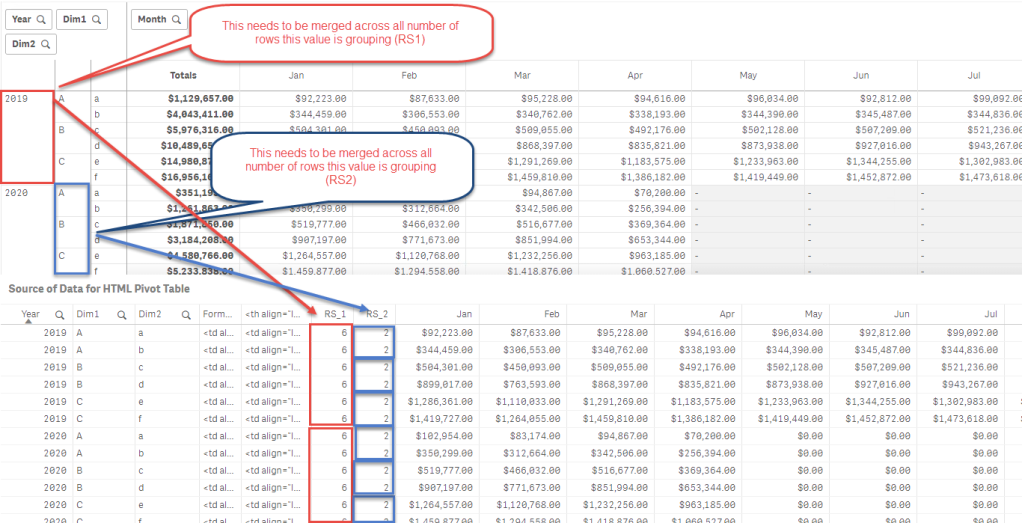
6 rows to be merged for Year column and 2 rows to be merged for Dim1 column – those number can change depending on selections
In the next step I create 2 more expressions. First one is to create a concatenated expression which would return html <td> tags based on existing values in the table measures. This will also respect any selections in your data model. For that I am using IF statement which assumes that I know what the column names will be and I am using a reference to column name to simplify it. At the same time I could use Column() function instead.
If(sum(Total {<Month*={'$(=FieldValue('Month',1))'}>}Expression1)<>0,'<td align="right">'&Jan&'</td>')
&If(sum(Total {<Month*={'$(=FieldValue('Month',2))'}>}Expression1)<>0,'<td align="right">'&Feb&'</td>')
&If(sum(Total {<Month*={'$(=FieldValue('Month',3))'}>}Expression1)<>0,'<td align="right">'&Mar&'</td>')
&If(sum(Total {<Month*={'$(=FieldValue('Month',4))'}>}Expression1)<>0,'<td align="right">'&Apr&'</td>')
&If(sum(Total {<Month*={'$(=FieldValue('Month',5))'}>}Expression1)<>0,'<td align="right">'&May&'</td>')
&If(sum(Total {<Month*={'$(=FieldValue('Month',6))'}>}Expression1)<>0,'<td align="right">'&Jun&'</td>')
&If(sum(Total {<Month*={'$(=FieldValue('Month',7))'}>}Expression1)<>0,'<td align="right">'&Jul&'</td>')
&If(sum(Total {<Month*={'$(=FieldValue('Month',8))'}>}Expression1)<>0,'<td align="right">'&Aug&'</td>')
&If(sum(Total {<Month*={'$(=FieldValue('Month',9))'}>}Expression1)<>0,'<td align="right">'&Sep&'</td>')
&If(sum(Total {<Month*={'$(=FieldValue('Month',10))'}>}Expression1)<>0,'<td align="right">'&Oct&'</td>')
&If(sum(Total {<Month*={'$(=FieldValue('Month',11))'}>}Expression1)<>0,'<td align="right">'&Nov&'</td>')
&If(sum(Total {<Month*={'$(=FieldValue('Month',12))'}>}Expression1)<>0,'<td align="right">'&Dec&'</td>')
&If(sum(Expression1)<>0,'<td>'&TotalMonth&'</td>')
The second and at the same time the most important expression is the one which will create combined HTML code for dimensions and measures. this one uses rowspan to merge cells for Year and Dimension 1 based on calculated RS_1 and RS_2 values
If(Year<>Above(Total Year),
	'<td  align="left" rowspan="'&RS_1&'">'&Concat(DISTINCT Year)&'</td>'
	&If(Dim1<>Above(Total Dim1),'<td align="left" rowspan="'&RS_2&'">'&Concat(DISTINCT Dim1)&'</td>'
		&'<td align="left">'&Dim2&'</td>'
		&Column(1),
		'<td align="left">'&Dim2&'</td>'
		&Column(1)),
	If(Dim1<>Above(Total Dim1),'<td  align="left" rowspan="'&RS_2&'">'&Concat(DISTINCT Dim1)&'</td>'
		&'<td align="left">'&Dim2&'</td>'
		&Column(1),
		'<td align="left">'&Dim2&'</td>'
		&Column(1)))
For this I also must create correct header so the pivot table headers are created properly. The static headers are Year, Dimension 1, Dimension 2 and Total. Between Dimension 2 and Total there are variable headers which will create labels for Months based on selection.
'<th align="left">Year</th><th align="left">Dimension 1</th><th align="left">Dimension 2</th>'&Concat(DISTINCT '<th align="right">'&Month&'</th>','',num(Month))&'<th align="right">Total</th>'Last 2 expressions could be written as one expression. I used 2 expressions on purpose as it is much easier to see how it all works when it is all broken into individual pieces.
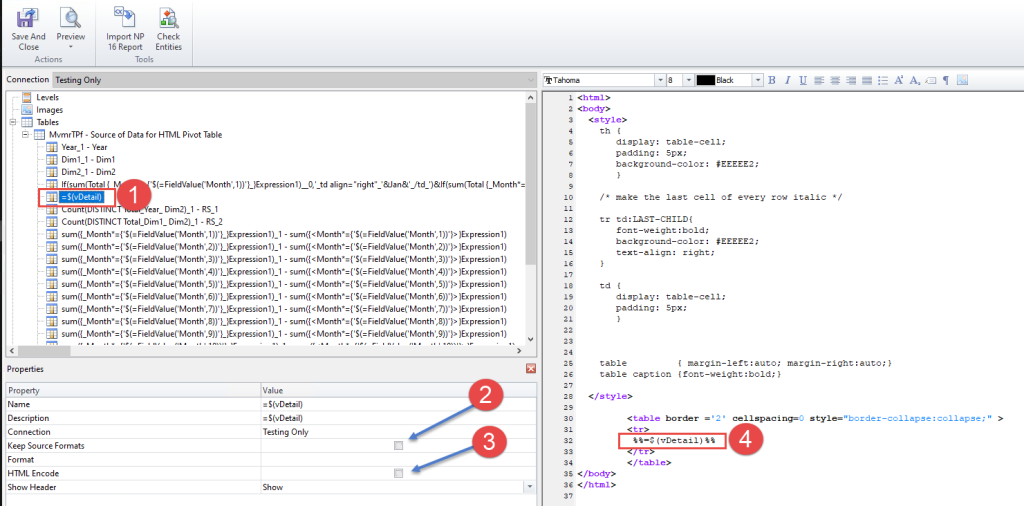
Now when we have the final expression written all what we need to do is to use it in NPrinting template. In NPrinting create HTML report and edit it in NPrinting Designer. Bring in table object we worked on. Important steps you need to do:
- Disable “Keep Source Formats”
- Disable “HTML Encode”
- Show Header: Show as this contains our pivot table header row
- Drag and drop that one column from the table which contains all logic to populate data in our HTML pivot table
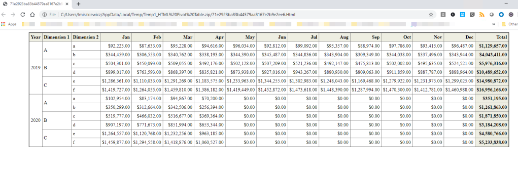
Feel free to copy & paste below code to have a simple version of the table. You may want to custom format your CSS style – I leave it to you. I did not pay attention to column width or background colours. I also did not check CSS compatibility with all browsers and mail clients. You will notice below that total column is rendered differently in web browser and in MsOutlook. I just wanted to show you a concept. Also look below for a screenshot on how it will look like once you start filter your data out.
<html>
<body>
  <style>
    th {
       display: table-cell;
       padding: 5px;
       background-color: #EEEEE2;
       }

    /* make the last cell of every row italic */

    tr td:LAST-CHILD{
       font-weight:bold;
       background-color: #EEEEE2;
       text-align: right;
    }

    td {
       display: table-cell;
       padding: 5px;
       }


    table         { margin-left:auto; margin-right:auto;}
    table caption {font-weight:bold;}

  </style>

         <table border ='2' cellspacing=0 style="border-collapse:collapse;" >
         <tr>
          %%=$(vDetail)%%
         </tr>
         </table>
</body>
</html>
This is final result. I know this is a lot of trouble to build a simple pivot table. I am however convinced that it is worth an effort, especially when you need to embed it in email body. Such table will look good in different email clients and will be to some extend responsive.


I hope you find it useful. Attached is Qlik Sense app here.
cheers!


Hi, a useful concept… i would like know if this can be extended… assume you want to highlight the background colour based on the value of the cell.. i.e in May there are few $0,00 values how would we go about conditionally formatting these… it doesnt have to be in a pivot table style a straight table style will do. thanks
LikeLike
Hi Shaun – conditional formatting in pivot table and using this concept can be implemented but it will look complex. The idea is quite simple for every column I have created you would need to create another one which would return text for the style formatting.
With the straight table concept is different though and it has been described on community on multiple occasions.
LikeLike
Is there a way of doing this that could cope with a variable number of columns depending on cycling through a dimensional value? (e.g. one customer has 4 columns, one customer has 20 columns)
LikeLike
Hi David – I am not sure if I understand your question. My example is showing this flexibility, so if you select just 1 quarter you will only get 4 columns with months. The limitation is that you need to set some maximum number of columns as for each column you need to write separate expression. It is quite easy given that you just copy/paste the same formula and change 1 parameter in set analysis
LikeLike
Hi lechmiszkiewicz i just wanted to know what code is there inside the variable vDetail which you are calling within tag in nprinting designer
LikeLike
Hi lechmiszkiewicz I just wanted to know what code written inside the variable vDetais which you are calling within tab in nprinting designer ?
LikeLike
Hi, It is an expression used as a column in Qlik Sense table. Sample app is attached to this post at the very end. It is also explained in the post.
LikeLike
it’s not a variable , it’s the name of the second column that you have created in your straight table
LikeLike
Hi Laurent.
It is a variable, which like you said is used as an expression of second column. There is also different expression used for its label as it needs to create table header. So here we have to be really precise on what is what
LikeLike
Perfect, but missing subtotal
How to insert subtotal in Dim1 and Dim2 ?
LikeLike
Subtotal? That is another topic which I will not be able to explain in comment here on blog. In short, you would have to create a grouping dimensions (which I very often refer to on Qlik Community). https://community.qlik.com/t5/Qlik-NPrinting-Discussions/Nprinting-HTML-Reports-with-Totals-and-Subtotals/td-p/1664570
LikeLike